The New School | Color of Wealth
Making the racial and ethnic wealth gap research at The New School more accessible by transforming data into engaging visual narratives.
Purpose
The Institute on Race, Power, and Political Economy at The New School has partnered with Graphicacy to transform their extensive data on racial wealth disparities into compelling visual narratives. We partnered with Graphicacy, a data visualization agency, and the Institute’s communications team, to produce a short collage-style, animated video that recaps the Chicago story and to support the Color of Wealth website launch.
This video explains the difference between wealth and income, adds in supporting data visualization and humanizing historical context, and ends on a hopeful note.
Services
Animation
Video Production
Storyboarding
Illustration
Client
Graphicacy
Credits
Design & Direction: Margaret To
Animation: Kari Pieterse
Music: Habitaat Music
Voiceover: Dr. Darrick Hamilton
Production: Graphicacy
Visual Treatment
The Color of Wealth report visualizes wealth disparities in America, city by city. Visualizing the key statistics from the report through data visualization animation, and leveraging historic photos from Chicago between 1910-1980, we created this mixed-media collage style as a powerful visualization to humanize this data and help people understand this critical issue. The overall tone is serious, evocative, and journalistic; gets heavier in the middle as we illustrate this issue rooted in history, and uplifting and hopeful towards the end.


Storyboard
We worked closely with The New School and Graphicacy's team to come up with visual metaphors showing the difference between wealth vs. income, and ensuring the photos and newspaper cuttings were accurate.


Impact
This 2-minute shareable piece helped The New School expand the reach of their website launch and report. “This video smartly captures the essence of key points from our 55-plus page report,” said Dr. Suparna Bhaskaran, cultural anthropologist and the Director of Research Partnerships at the Institute. “It not only transmits the information concisely, but its powerful visualizations help people understand — and hopefully inspires them to act.” See the summary of the entire data viz project on Graphicacy's Medium post.

More Projects

Re:wild | The Ranger SolutionAnimation
The New School | Color of WealthAnimation

TED-Ed | The Unnatural WorldAnimation

From Soil To Soul | DocuseriesVideo Production

SCOPE | What Is Decarbonization?Resource Guide

California State Parks | State SymbolsIllustrations

Urban Farmers' AlmanacResource Guide


Re:wild | Lost SpeciesAnimation


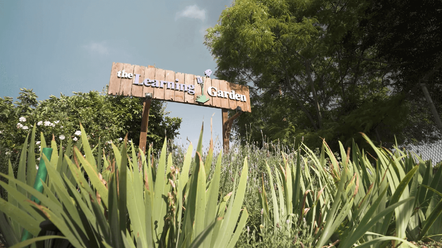
The Learning Garden | Regrow InitiativeVideo Production


Get Inspired | Ocean RestorationAnimation
VERGE Climate Tech Conference | Xiye BastidaVideo Production

Off Their Plate | Restaurant VoicesVideo Production
Copyright © 2026 Studio SAKA. All Rights Reserved. We acknowledge the Traditional Owners, Indigenous Peoples, Elders and Ancestral Spirits of the land we live and work on.